When Does the Bitcoin Rainbow Chart Say Buy?
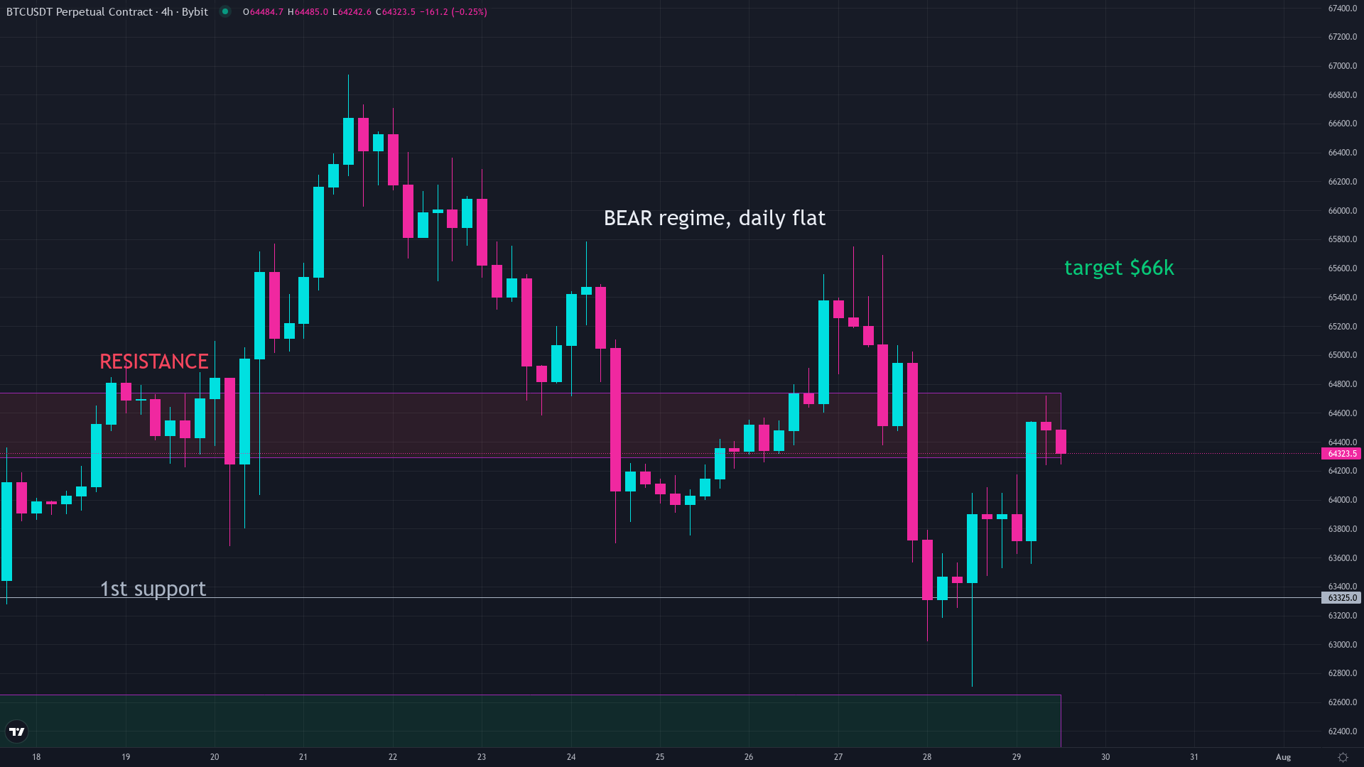
The Bitcoin rainbow chart has three zones painted in cool blues and teals, each labeled with a form of “buy.” Right now, near $64,000, Bitcoin is sitting inside one of them. Whether that actually tells you when to buy is a separate question, and the honest answer is more complicated than the color coding suggests.
Which colors on the rainbow chart mean buy
The rainbow chart divides Bitcoin’s price history into nine color bands. The bottom three are the ones people point to as value signals:
- Basically a Fire Sale (dark blue). The lowest band. Price has only touched here during the worst stretches of each bear market. Bitcoin briefly fell below even this floor in late June 2026.
- BUY! (blue). The second band. Still historically cheap territory by the chart’s own logic.
- Accumulate (teal). The third band. A zone where many long-term holders have historically started building positions.
Above these sit “Still Cheap,” “HODL!,” “Is This a Bubble?,” “FOMO Intensifies,” “Sell. Seriously. SELL!,” and “Maximum Bubble Territory.” The warmer the color, the more expensive Bitcoin looks against its long history. You can see exactly where Bitcoin sits today on the live rainbow chart.
What the blue bands have looked like in past cycles
The chart’s track record in the cool zone is genuinely interesting. Every major bear market has pushed Bitcoin into the blue or teal bands at some point, and every time, the price eventually recovered and went on to make a new high.
In 2018 and early 2019, Bitcoin spent roughly four months in the blue zone before the next bull run began. In 2020, the pandemic crash briefly tagged the Fire Sale band, then bounced within weeks. In 2022, the story got messier. Bitcoin entered the blue zone near $30,000 in June 2022. Most people looking at the rainbow chart at that point said the same thing: “it says buy.” Price then fell another 48 percent, bottoming near $15,500 in November 2022. The chart had not lied exactly, but the timing window inside the blue zone was brutal. Nearly six months of continued falling before the actual low arrived.
Today, near $64,000, Bitcoin is back in the deep blue zone. The chart is sending the same message it sent in June 2022.
Why the chart saying buy is not the same as this being the bottom
The rainbow chart was created in 2014 by a Reddit user named “azop,” building on a curved trend that had been drawn on BitcoinTalk earlier that year. The original version still says the chart has “no scientific basis” and is “a fun way of looking at long-term price movements.” Most people who screenshot it online crop that disclaimer out.
Here is what the chart actually does. It compares today’s price to the long-running trend since 2011. A blue reading means Bitcoin is trading far below that trend. That is genuinely useful information. What it cannot do is tell you when the trend reasserts itself. The blue zone can last a day or a year.
The bands are also wide enough that “buy” is not a precise signal. The gap between the top of Fire Sale and the bottom of Accumulate spans tens of thousands of dollars at current prices. A single band can contain multiple months of price action at wildly different price levels.
How to use the rainbow chart without fooling yourself
Think of it as a mood reading, not a timer. When the chart is deep blue, it is saying Bitcoin looks historically cheap. That shifts the question from “is this cheap?” to “what else would I want to see before acting?”
In past cycles, the most reliable bottom signals came when several tools agreed at once. Bitcoin price falling below its MVRV ratio of 1, the rainbow chart hitting dark blue, and the Fear and Greed Index printing in single digits at the same time. Those combinations have marked the deeper floors. None of them has been reliable enough alone.
The rainbow chart belongs in your toolkit as one input. When price is in the red zones, the chart is saying risk looks elevated versus history. When it is blue, the chart is saying risk looks lower than average versus history. It is not a buy button.
Right now the chart is flashing blue. That is the same signal it sent in June 2022. What followed 2022 was a full recovery and a run to new highs. The wait was longer than most people expected. That is about as honest as the chart gets.
Common questions
When does the bitcoin rainbow chart say buy?
The three coolest bands on the chart, Fire Sale (dark blue), BUY! (blue), and Accumulate (teal), are the buy zones. They appear when Bitcoin is trading far below its long-running historical trend.
What color means buy on the bitcoin rainbow chart?
Dark blue, blue, and teal are the three buy-zone colors. The warmer the color gets (orange, red), the more expensive Bitcoin looks versus its own history.
Has the rainbow chart buy signal ever been wrong about timing?
Yes. In June 2022, the chart entered the blue buy zone near $30,000, and Bitcoin fell another 48 percent before bottoming near $15,500 in November 2022. The zone lasted months, not days.
Where is bitcoin on the rainbow chart right now?
As of late July 2026, with Bitcoin near $64,000, the chart places price in the deep blue zone, the same level it flagged during the first half of the 2022 bear market.
Can you time bitcoin bottoms with the rainbow chart alone?
No. The blue zones can last from a few weeks to over a year. The chart shows Bitcoin is historically cheap, but it cannot tell you when the price actually turns. Use it as one signal among several.
Keep reading
We break down the market like this every day, free on Instagram and YouTube, and in depth inside the community.
Education, not financial advice. Trading involves real risk.